Responsive Web Design
Today, about half of web traffic comes from mobile devices and that trend only looks to increase. Frankly, if your website isn't built to be mobile-friendly, you'll fall by the wayside.
From Adaptive to Responsive
When mobile web browsing first began, organizations and web designers knew they had a problem. The web used to be designed to minimize scrolling: maximizing the amount of information you could fit on your screen. With users now viewing sites on much smaller screens, websites needed to be able to adapt for that experience.
The first solution to this problem was coined Adaptive Web Design. With this, if the browser detected the page was loaded on a mobile device, it would redirect the user to the mobile version of the site. Web designers basically built two separate websites, one for desktop users and the other for mobile.
As the number of mobile devices increased and screen sizes became more diverse, the adaptive web design solution was to have a specific website for each screen size. You can see how this quickly became less of a solution and more of a problem. Not only did the multiple versions of a website make more work for web designers, they also crowded server space.
The web needed Responsive Web Design: a single web page that could change based on the size of the screen it is being viewed upon. It's the same concept as adaptive web design, just more efficient. With a single version of a website, designers can ensure that every user has access to all of the information they need, while keeping maintenance and back-end space down.

Media Queries
Media Queries are used within CSS to create responsive web pages. Basic media queries change the styling of your webpage depending on if it meets certain specifications such as screen size or orientation.
The Structure of a Media Query
@media screen and (min-width: 480px) {
styles
}
"@media"
Begins your query
"screen"
Your media type selects which type of format will be subject to these rules. Usually we see "screen" selected.
"and"
The and operator is used for joining media types with media features .
"(min-width: 480px)"
The media feature tells the browser which condition must meet the specifications to apply this code contained in our media query. Media features describe specific characteristics of the media type. In this case, screens larger than 480 pixels.
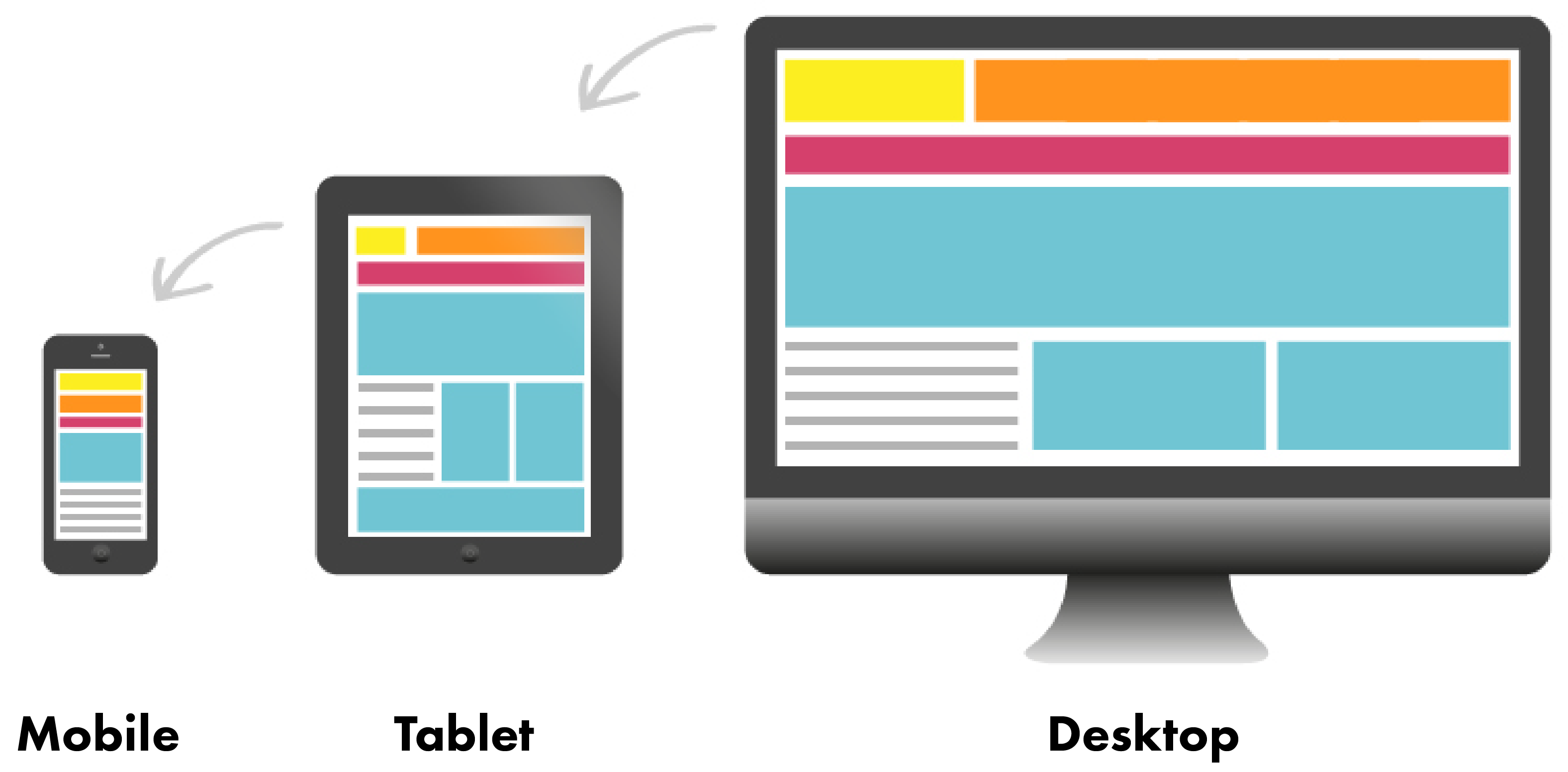
Breakpoints
The 480px in the example media query is the device breakpoint for the styles. So the next question is what breakpoints should you use for your website?
There are a lot of opinions around the specific breakpoints web designers should use. Ideally, the breakpoints should be defined by the specific needs of each project, but a good starting point for screen widths can always be:
600px (mobile), 900px (tablet), 1200px (desktop)
The picture above is an example of what layouts might look like with these three breakpoints.
Back to Top ↑